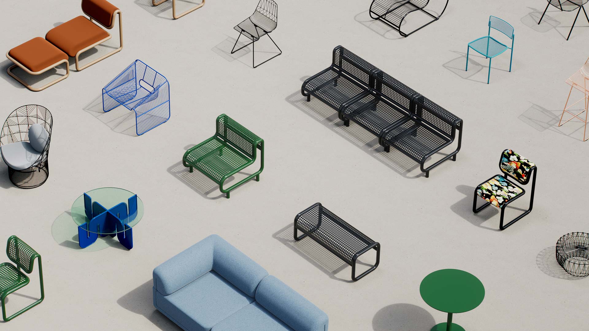
If you've been following Bend for a while, then you know that we take the design of more than just our furniture seriously. Whether it's our website, marketing campaigns or even just our daily social media posts, we love everything to look as beautiful as it can. We spend a lot of time researching topics like how to create layouts and typography. Even concepts that simply are art forms in themselves and can make a world of difference without you even realizing.
One of our big initiatives for this first month of 2017 was to rework and redesign our newsletter. It may sound cheesy but we really love keeping everyone updated on all things Bend and we want to make sure we are doing it in the most visually pleasing and compelling ways possible. We found this great article on Fast Company Design that really broke down the importance of not cutting corners and going the extra design mile. We're giving you their 5 things to remember below, but we highly recommend that you read the entire article HERE. Make sure to signup for our newsletter too. We have promotions and giveaways planned all throughout 2017 that will be exclusive to that e-mailer. Just scroll to the bottom of this page, enter your email and click JOIN. It's as easy as that!
1. Remember the writer is as important as the designer.
Ad agencies have always revered writers as the driving force in the creative process. Consider the most iconic ad campaigns, from "By Mennen!" to "Pardon me, but do you have any Grey Poupon?": Writers were generally responsible for the conceptual heavy lifting. But design agencies have never held writers in the same regard. When you live in a world where content is king, the design agency that does not have a full-time writer on each of its projects is a foolish one. The writer is as important as the designer.
2. Design with real content from the start.
This goes way beyond avoiding "lorum ipsum." It means hiring a content strategist and a shit-hot writer to create a concept for what and where you need content and even entire sections for your digital product, as well defining the style of writing, tone of voice, and creative. Involving writers from the start will shape the structure of your project every bit as much as what the UX designer does. For some clients, it could also mean consulting on the overall editorial strategy.
3. Take a cue from ad agencies for art direction.
See the attention to detail the big ad agencies give to art direction? That is the benchmark for digital products, too. Every image in your design needs to be considered, art directed, and retouched. Think your image is perfect out of the box? Sorry, but that’s not the case. I have never seen a photograph or illustration that didn't need at least some minor retouching/editing to be optimized for a digital context. The art direction of your content is as important as the interface. Consider the art direction work the New York Times puts into every piece of content in its visual stories. Every pixel is considered and treated with huge attention to detail.
4. Don't design in the browser for early stages.
You may be the Master Unicorn of design and code, but designing in code or in interface tools in the beginning stages will create more work in the long run. Tools like Sketch are not great for developing visuals and art direction concepts. Use Sketch for making interfaces, nothing else.
5. User-generated content needs design, too.
User-generated content is not an excuse to use the gray boxes of doom. There are always ways to design UGC, whether by applying filters or presenting content in a more creative way. HelloGiggles, a client we recently worked with at Edenspiekermann, publishes more than 70 pieces of content per day, about a third of it user-generated. The user profile photos were usually low-quality, so we commissioned illustrator Chris DeLorenzo to create a series of avatars and illustrations so that the pages maintained a clear, uniform aesthetic.


